Data Visualization
Great data visualization quickly helps users make informed decisions.
Overview
Data tells a story. In the context of MX applications, data should help users make more informed decisions on the path to becoming financially strong for themselves or their organization. The right visualization aids in identifying trends, tracking progress, encouraging exploration, and knowing when things are not quite right.
General principals
Decision Framework
Design decisions around how or whether to use data visualization should consider the following guidelines in order of importance.
- Relevancy
- What is this chart for? If properly understood, is it helpful?
- Accuracy
- Is the underlying data correct? Is it refreshed and timely? Does the chart convey the data’s true meaning?
- Clarity
- Who is the intended user? Does the visualization meet them at their level of understanding? (for example, consider a data scientist at a bank using our Analytics Suite vs. a child first learning about money through the Helios Kids’ App) Does it help the user take a specific action?
- Personality
- Is the data enhanced by putting it in visual form? Does it tell a story and provide insight or simply display information?
Progression disclosure
Not all data needs to be revealed immediately. In fact, this can be overwhelming for the user. Using hover, touch and hold gestures, and click drill-downs encourages chart exploration and expands the data story according to the user’s continued interest.
Types of visualizations
Choosing the right chart type is fundamental to aiding and not misleading the users’ understanding of the data. Aim for appropriateness, however, you should ideate on multiple possible solutions. Often a new visualization type can unlock a user's understanding of a data set.
Consult the chart type guidelines below for assistance in correctly using a chosen chart type. When choosing, consider what information is being conveyed. For example, is the data trending, or comparative? Does the data represent distinct categories or a continuous dimension?
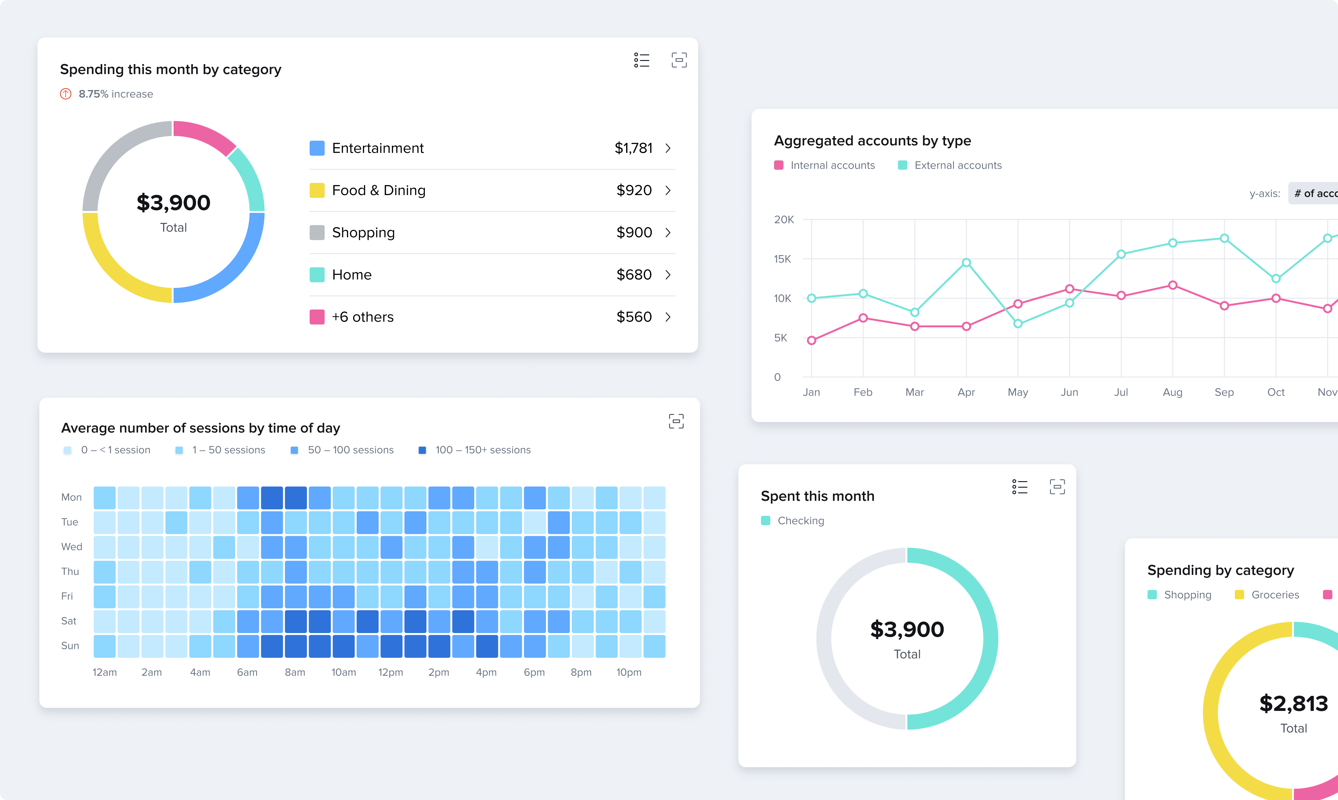
Bar Chart
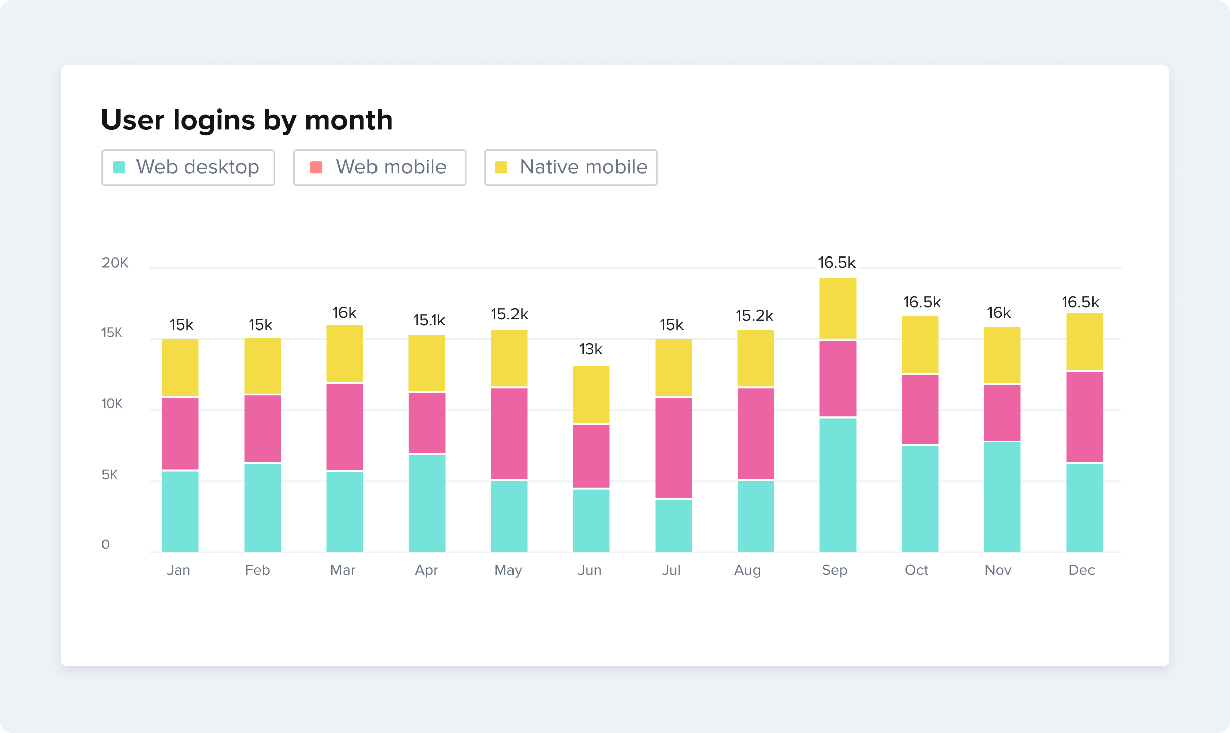
Bar graphs should be used to compare different values that are hierarchically equivalent. A stacked bar chart can be used to aggregate categorical data. Bars are rounded on the top (according to the theme border radius) while the bar’s baseline is left squared. Use whitespace between bars to adequately separate bars from each other, one rule of thumb is to provide spacing roughly half the width of the bars themselves. A Bar chart should always start with a baseline of zero.
Horizontal Bar
Follows many guidelines of a vertical bar chart. The order of bars starts with the dimension that has the highest value across the dataset. Use a horizontal bar when the length of bar labels can potentially run long or when there are too many values to adequately label in a vertical style.
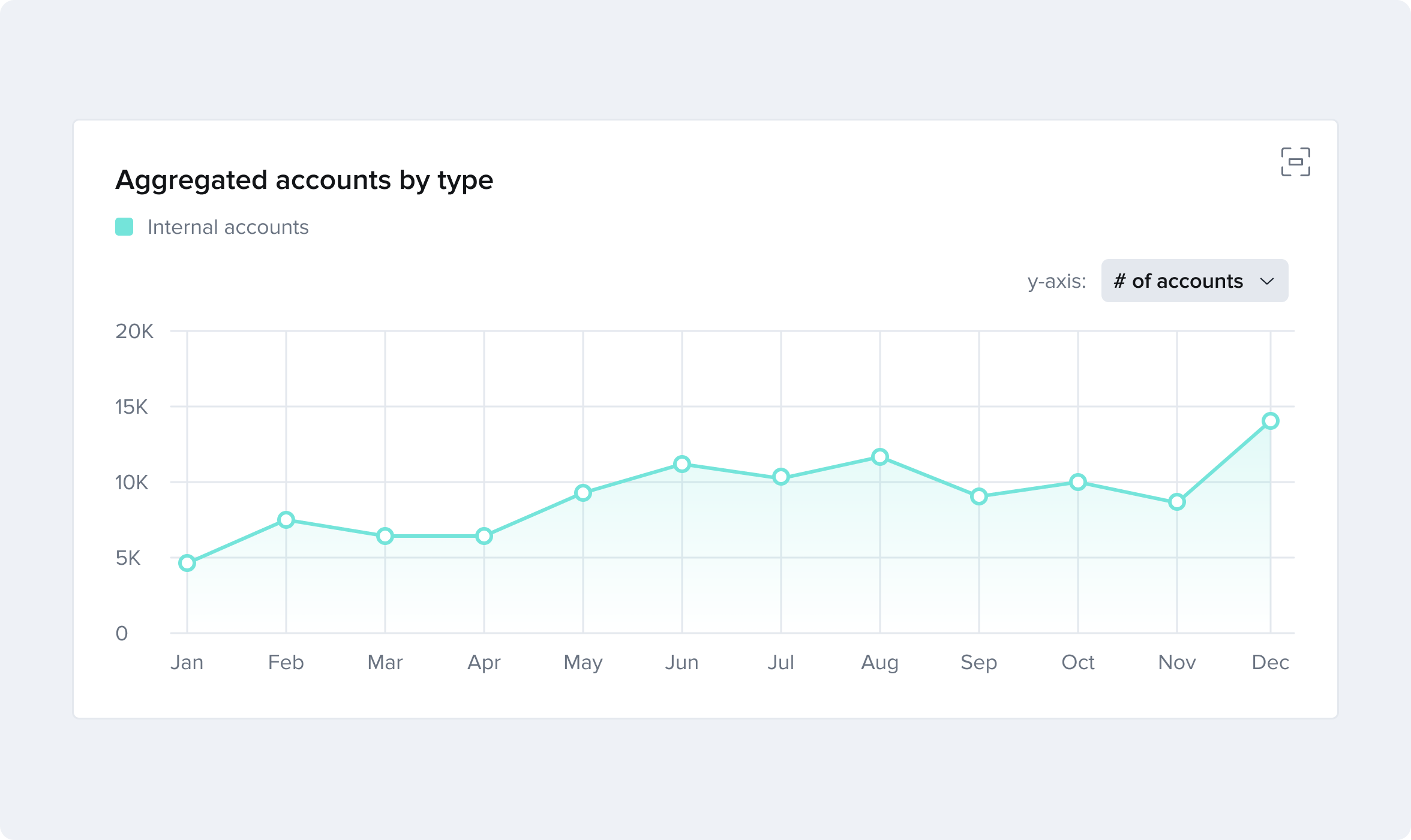
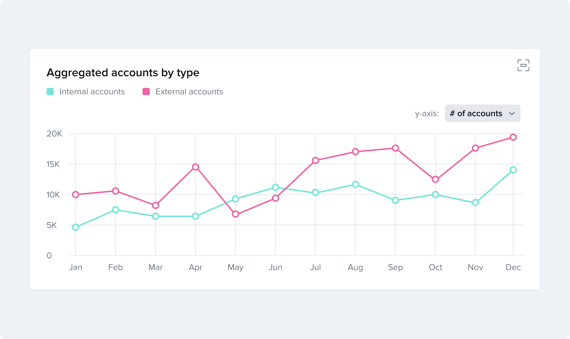
Line
This graph model is the best option for showing changes in a dimension over time. Use lines to display information as a series of data points connected by straight line segments. Line graphs are used to track changes over short and long periods of time. When smaller changes exist or data is more-or-less continuous, it’s better to use line graphs than bar graphs. Line graphs can also be used to compare changes over the same period of time for more than one group.
With only a single line it is appropriate to add a gradient beneath the line (see example below). However, gradients should be omitted when more than one line is compared.
When forecasting future data make sure to visually indicate the uncertainty of future events such as providing a range of likely scenarios rather than a definitive value, by dotting a line to compare to a solid historical line, or shading the area of the chart indicating the future.
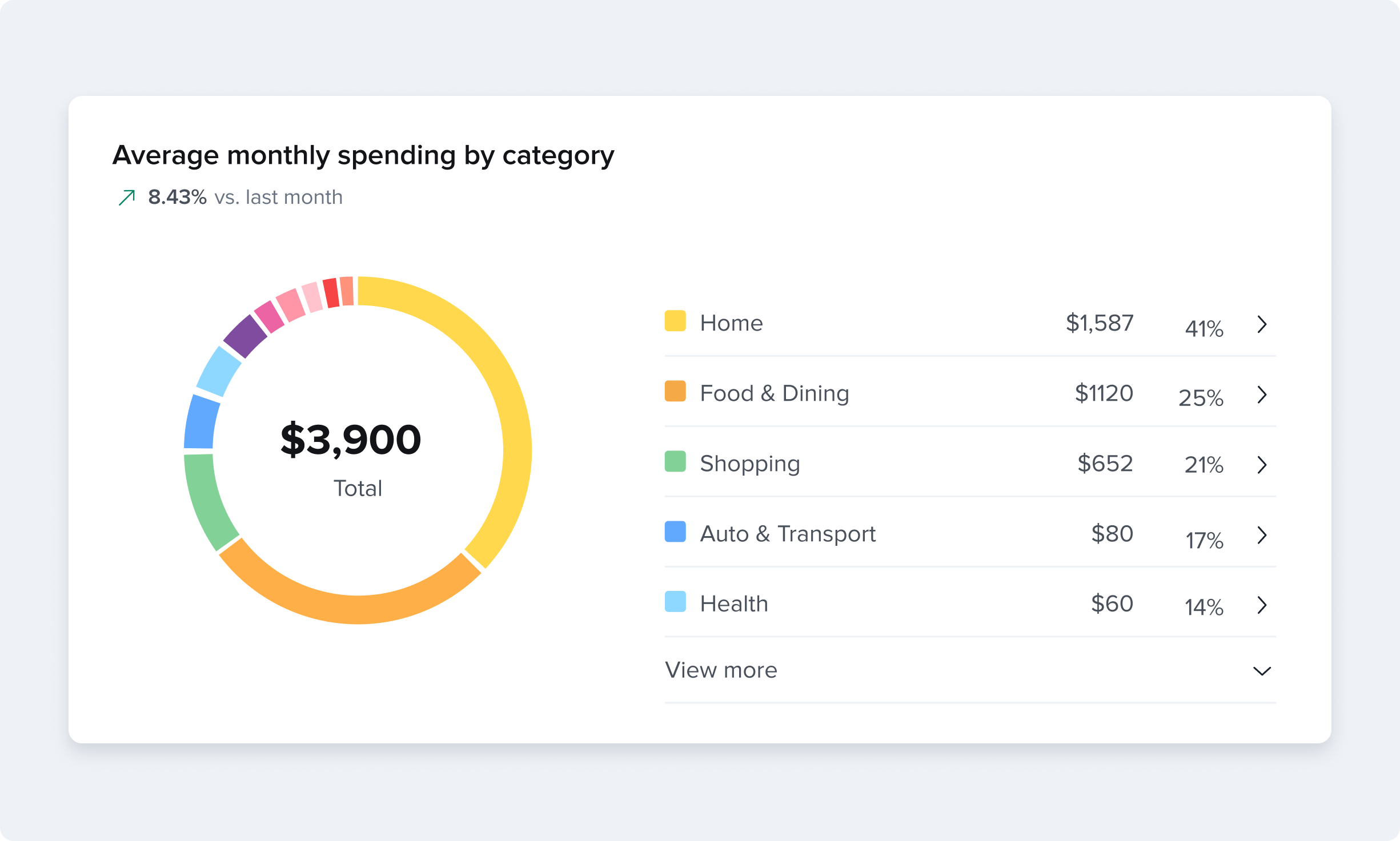
Pie or Donut Chart
A circular graph model divided into sectors, illustrating proportions. Use only when the different values add up to a total and there is a need to highlight percentages. Because the human eye can better interpret length than angles, a bar chart is often better for comparing values.
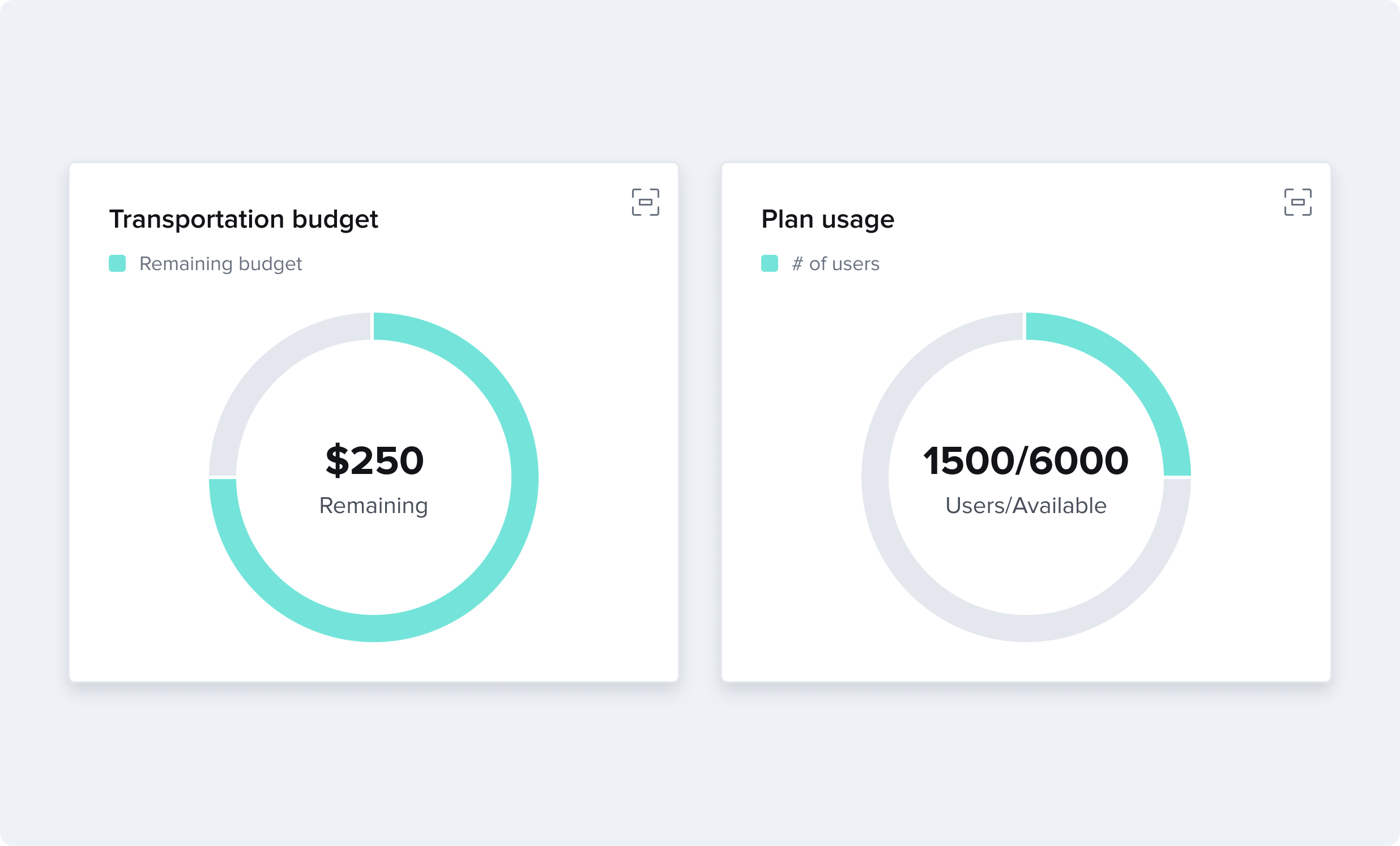
Radial Gauge
Used to represent a proportion to a whole such as a percent completion of a goal or a percent spent of a budget. A radial gauge can progress either by filling or draining, depending on the context. The gauge should fill clockwise and drain counterclockwise.
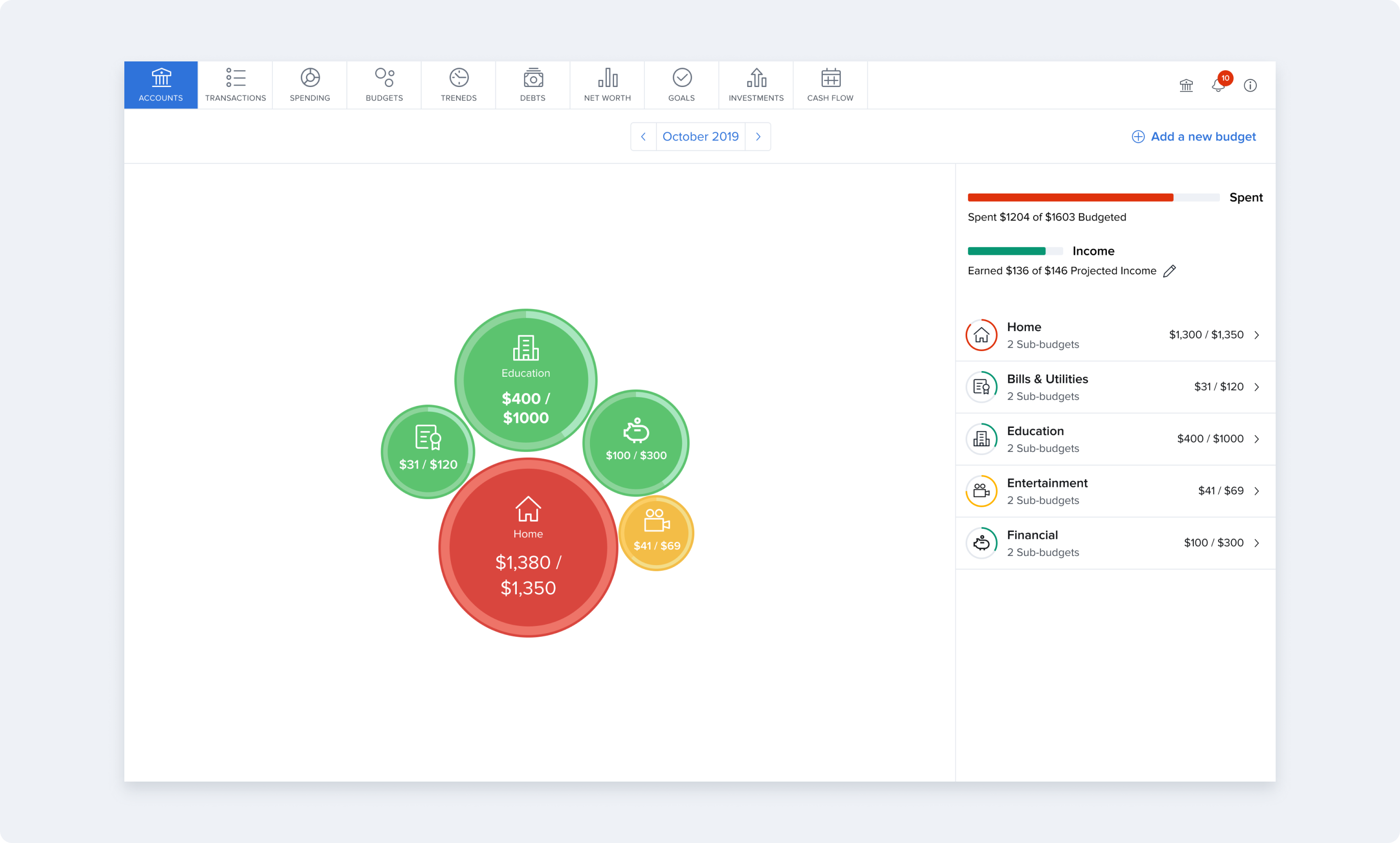
Bubble budget
A bubble chart is a model used to show values among categories or groups with circles, avoiding any kind of axis. Can be used as a friendlier alternative to a bar chart. Adding gravitation effects can increase playfulness as in our bubble budgets.
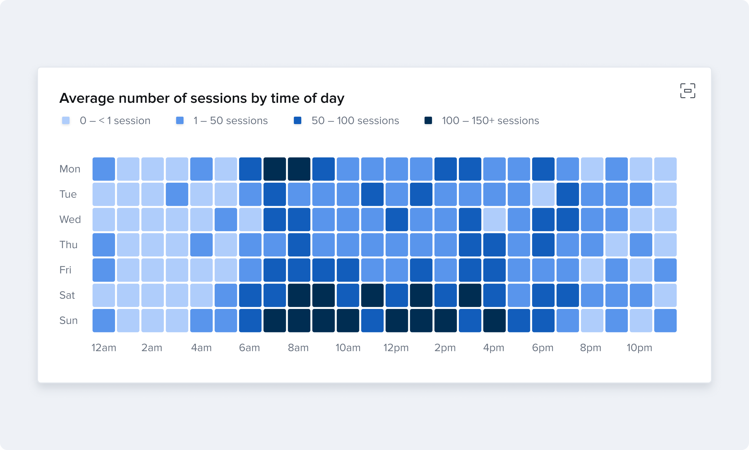
Heatmap
Represents mutual correlations of variables within a data set. Use it to highlight clusters, patterns, and distribution among indicators which might be correlated. A rule of thumb to follow when designing heat maps is: the larger the value, the darker the color. The smaller the value, the lighter the color.
Elements of Data Visualization
Axes, Legends, and Grid Lines
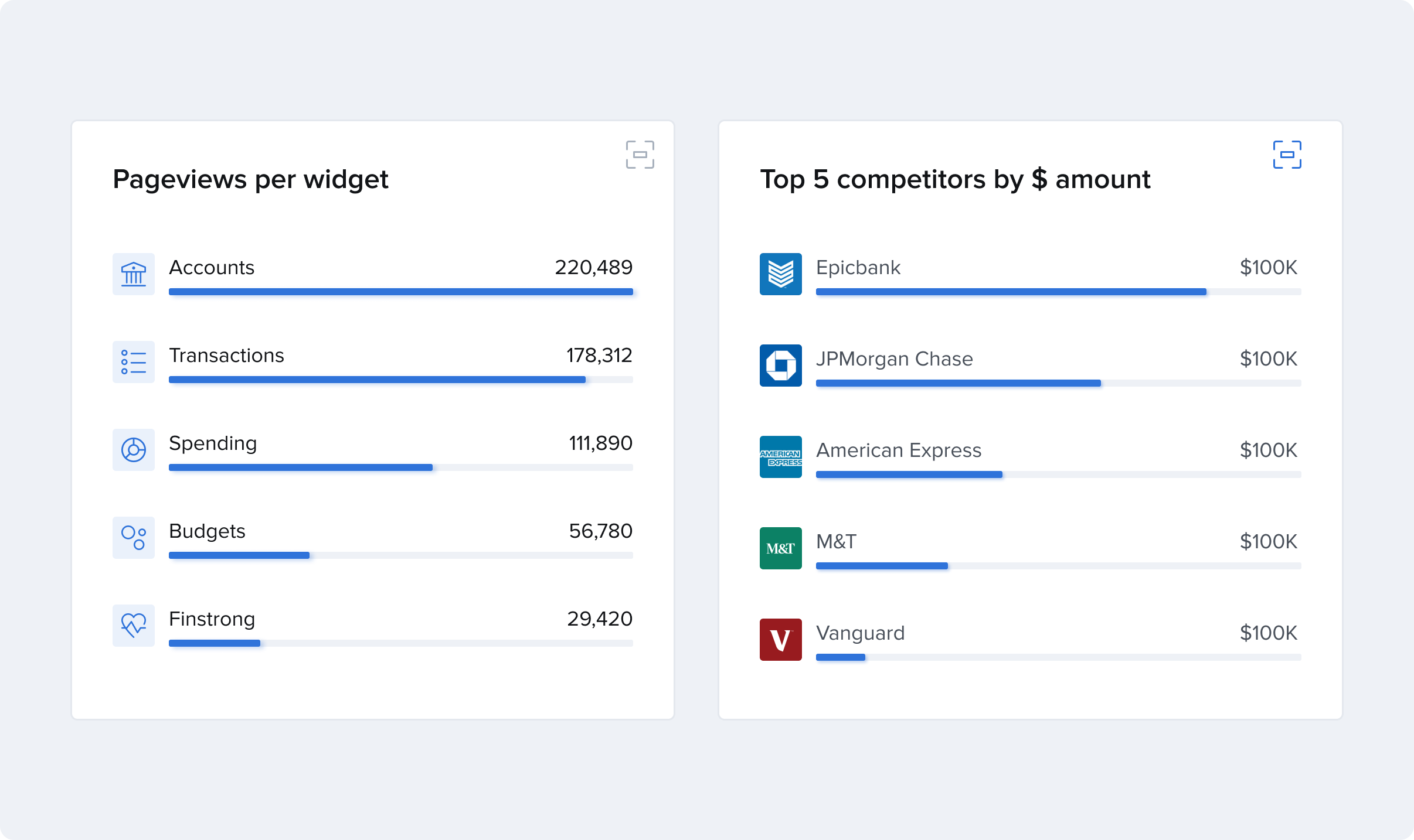
The use of legends, axis labels, grid lines, and other chart elements is up to the designer’s discretion using the General Principles outlined above. A Bar chart should always start with a baseline of zero. Other increments should follow a logical scale to the data and should be whole (rounded) numbers whenever possible. For example, Increments of fives, tens, hundreds or thousands prove the most readable (ie: 0, 10, 20, 30, … or 0, 25, 50, 75, … instead of 0, 8, 16, 24, 32, …).
Labeling individual data values allow for greater data accessibility even when deselected bars have low color contrast ratios with the background. Consider this option particularly if grid lines are not used.
Additional annotation lines may be used to show historical averages, trends, or a metric target but should be clearly labeled.
Colors
Color is a critical component for telling a story and alerting the user to important values. However, you should avoid using color by itself to provide meaning as users with color blindness may lose understanding. Colors should be distinct from one another and provide sufficient contrast to meet current WCAG guidelines.
Keep in mind whether datasets are related or unrelated to decide whether colors should be on a sequential scale or a categorical scale. Remember, certain colors already contain cultural metaphors. For example, in western color green=good while red=bad.
Default chart colors
Mono chart colors
Accessibility
Making data visualization accessible to everyone is crucial, especially when designing visual analytics tools to help people understand phenomena and make strategic decisions. Here are some things to keep in mind when designing for people with visual impairments.
Low vision
For people who are blind, include text descriptions of any meaningful images that can be read by assistive technology (screen readers). A person with low vision is still able to perceive visual insights with the help of accessibility features and considerations.
- Provide the opportunity to increase the size of elements and focus on particular areas by zooming and magnifying.
- Follow the WCAG 2.0 Level AA guidelines for contrast — high contrast is crucial to improve legibility. Body text should have a contrast ratio of at least 4.5:1 (and large text should be at least 3:1) against its background color. Label chart data values to provide alternatives to visual information (especially color).
- Use captions and always provide a table version of the visualization.
- Allow keyboard alternatives for navigating graphical user interfaces.
Color Blindness
The two most common forms of color blindness are deuteranomaly and deuteranopia — which together account for about 6% of men, and protanomaly and protanopia, which account for another 2%. Tritanopia is very rare, and affects less than 0.001% of men.
For those affected the two most difficult colors to distinguish are green and red. Stressing the contrast between dark and light values is a good way to make the colors recognizable. While hue and saturation have minimal effect on legibility, brightness differences are far more perceptible.
Use color blindness simulator software to test your designs. This one is good.